

- This topic is empty.
-
AuthorPosts
-
2026-10-14 at 1:33 pm #12202
Planning Cap and Bottle Graphics on Square Lip Gloss Packaging
A square or rectangular lip gloss pack gives artwork distinct faces to occupy. It also makes the relationship between the cap and bottle easy to see. Before designing a logo or line that continues across their join, a brand should establish how the actual closure positions the two parts when the pack is normally closed.
Define the front on the complete pack
Choose the intended front view using an assembled sample. Identify the corresponding bottle face and cap face in the decoration brief, with a drawing or photograph that makes the relationship unambiguous. Include the viewing direction for any artwork on the cap top.
The outside profile alone does not identify the closed position. Four exterior faces do not mean that a closure has four valid closed positions, nor that the cap can be turned freely after it is seated. That relationship depends on the particular assembly.
Check the closure before relying on graphic alignment
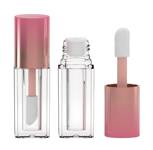
The exterior faces are visible here. The photograph alone does not establish the cap’s repeatable closed orientation.
Use the selected model and matched components to examine the cap’s normal closed position. Open and close samples in the intended manner, without forcing a preferred artwork position. Compare the result with the proposed front view and ask how any relevant variation will be assessed.
A cap that appears aligned in one product photograph is not sufficient evidence for a graphic that must align across a production range. Agree the required relationship and its evaluation before approving artwork that depends on it.
Choose a layout that fits the confirmed relationship
If the cap and bottle have a suitable, repeatable relationship, a continuous motif can be considered. Its design still needs room for the actual gap, adjacent edges and the agreed alignment requirements. A very thin line crossing the join can make small differences more conspicuous than a broader, independent element.
If a continuous motif is unsuitable, give each part a self-contained design. A bottle logo and a separate cap treatment can share color and style without needing to form one uninterrupted picture. Repeating decoration on more than one face may also suit the design, but it should be evaluated against the actual closed positions rather than assumed to solve every rotation issue.
Top-of-cap artwork deserves its own check. Moving a mark to the top changes its viewing direction; words or a directional symbol can still require an agreed orientation relative to the bottle front.
Approve each printable face on the physical sample
Use the model’s actual print area and relevant drawing details. Exterior width and height alone do not establish the usable decoration area, corner margins or cap-to-bottle relationship. When changing a model or cap, review the artwork on the new configuration instead of transferring it solely because the outside dimensions are similar.
Record the agreed front view, artwork version and component configuration together. Sambound’s empty lip gloss packaging and customization information at sambound.com can provide context for that discussion; the physical sample and current specification define the particular arrangement being approved.
The graphic layout should follow the confirmed assembly. That allows the pack to present a clear brand identity through either coordinated independent elements or a deliberately controlled motif across the join.
sambound.com
SamBound New Material Technology Company Ltd. -
AuthorPosts

- You must be logged in to reply to this topic.